By the Lily Campbell Team
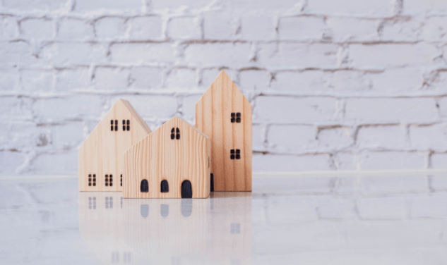
Walk into any room painted the wrong color, and you feel it immediately. Something is off. The space feels smaller than it is, or colder, or strangely dim even with the lights on. On the flip side, when you walk into a room where the color is exactly right, the effect is almost invisible; you simply feel right at home. That is the science of color at work, and when you are choosing paint tones for your home in Fountain Valley, understanding that science can make the difference between a space that feels like yours and one that constantly works against you.
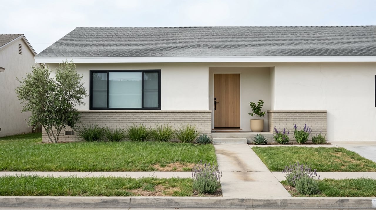
Fountain Valley's homes span a range of architectural styles, from mid-century ranches to updated residences, and the region's coastal proximity plays a real role in how color behaves inside them. The abundant natural light, the slight marine layer that filters the morning sun, and the warm afternoons; all of those factors impact how a paint color reads on your walls.
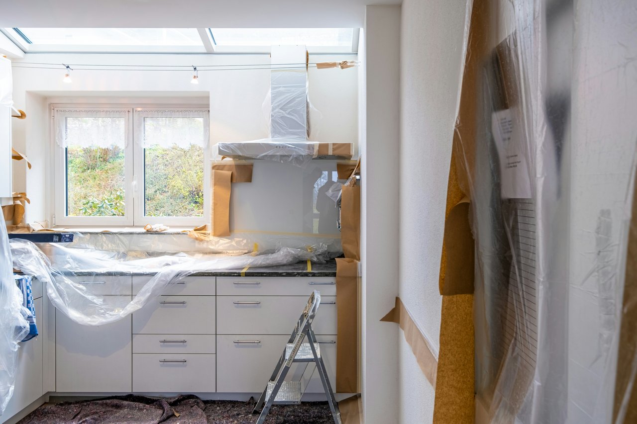
What looks perfect in a showroom might read completely differently in your living space, and that is exactly why choosing paint tones deserves more thought than most homeowners give it.
Whether you are refreshing your home for your own enjoyment or preparing to list your property for sale, understanding how color interacts with light, space, and emotion will help you make choices you will feel confident in.
Key Takeaways
- The direction your rooms face determines how much warm or cool light enters, which directly affects how paint colors appear at different times of day.
- Undertones in paint colors are often invisible on a chip but become prominent once a color goes on the wall, making sample testing essential.
- Coastal light in Fountain Valley tends to be bright and slightly cool, which means that warm neutrals often perform better than stark whites or cool grays.
- Color psychology is well-documented; certain hues reliably influence mood, energy levels, and perceived room size.
- A cohesive color palette throughout your home creates flow that feels intentional and polished.
Understanding Light
Light is the first variable to study before you ever open a paint fan deck. Every room in your Fountain Valley home receives a different quality of light, depending on which direction the windows face — and that light changes the character of every color on the wall.
North-facing rooms receive indirect light that tends to read cooler and slightly blue throughout the day. Colors that seem warm and inviting on a paint chip can appear flat or dingy in these rooms. If you have a north-facing bedroom or home office, leaning into warmer paint tones like creamy whites, soft taupes, and warm greiges will counteract that inherent coolness and make the room feel more alive. Cooler grays and blues, by contrast, can feel heavy and dim.
South-facing rooms are the lucky ones. They receive consistent, warm natural light throughout the day, which means that they can handle a wider range of colors. Cool blues and greens look vibrant in south-facing spaces because the warmth of the light balances the coolness of the color. Stark whites look crisp rather than sterile. Even deep, saturated tones work in these rooms.
What to Consider Before Buying Paint
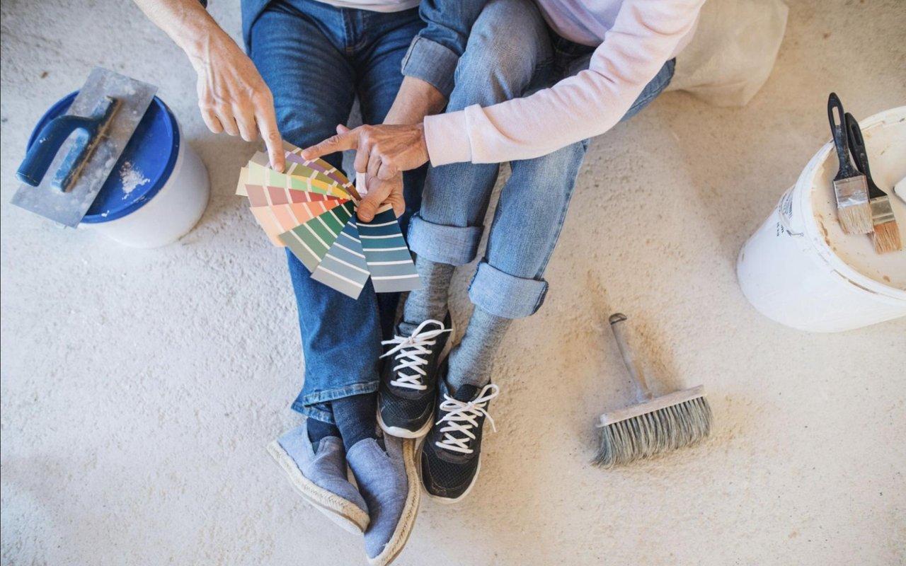
- Test your samples on multiple walls, not just one, since light hits each surface differently throughout the day.
- Observe your sample during morning, midday, and evening to understand how much the color shifts under different lighting conditions.
- Consider artificial lighting alongside natural light; warm-toned bulbs pull out yellow undertones, while cool LED lights amplify blues and grays.
- Look at the room's fixed elements, including flooring, cabinetry, and trim, before committing to a wall color, since undertones must harmonize across all surfaces.
The Hidden World of Undertones
Most homeowners look at paint colors and see the surface: beige, gray, or white. What they miss, however, is the undertone — the secondary hue that lives beneath the primary color and makes itself known once the paint is on the wall at scale. Understanding undertones is one of the most practical skills you can develop when choosing paint tones for your home.
Every neutral has an undertone. That gray you loved in the store may have a strong purple or green undertone that becomes unmistakable once it covers an entire wall. That crisp white might pull toward yellow or pink in the afternoon light. Beige can lean orange, lavender, or green, depending on its formulation, and none of that is visible on a small chip held in a brightly lit hardware store.
The way to test undertones is simple. Hold a pure white card next to your paint sample. Whatever color you see in the paint chip compared to the white card is its undertone. Alternatively, paint a large swatch on your wall and observe it against your trim. If your trim is a warm white and your wall color has a cool gray undertone, they will fight each other in a way that reads as unfinished or accidental.
Common Undertone Pairings That Work
- Warm greige walls paired with creamy white trim create a cohesive, inviting palette that reads effortlessly in Fountain Valley's natural light.
- Soft blue-green walls work well with crisp, cool-white trim in coastal-influenced homes where the color story leans toward the ocean.
- Warm taupe with wood-toned flooring and brushed gold hardware creates a sophisticated, layered effect that feels current without being too trendy.
- Light sage paired with warm white ceilings and natural wood accents suits casual, open layouts.
Color Psychology and How It Shapes a Room
When you are selecting paint tones for your home, understanding the emotional weight of different colors helps you design spaces that work for how you actually live in them.
Blue is one of the most reliably calming colors available, which explains why it performs so well in bedrooms and bathrooms. Studies consistently find that blue environments lower heart rate and create a sense of mental quiet. In a Fountain Valley bedroom that already benefits from proximity to the ocean and a relaxed Southern California pace, a soft, dusty blue on the walls reinforces that sense of ease.
Warm yellows and soft oranges, used sparingly, can enhance energy and creativity. These tones tend to perform well in kitchens and breakfast areas where you want a sense of warmth and activity.
Deep greens carry associations with nature, restoration, and focus, which makes them compelling choices for home offices and reading rooms. Understanding the intended emotional function of a room helps narrow down your palette before you even begin comparing shades.
Colors by Room Function
- Bedrooms benefit from soft blues, muted lavenders, and warm greiges that signal rest and quiet to the nervous system.
- Kitchens and dining areas respond well to warm whites, soft yellows, and terracotta tones that encourage warmth and appetite.
- Home offices tend to thrive with grounded greens, deep blues, or warm neutrals that support focus without visual distraction.
- Living rooms are the most flexible spaces; a warm greige or sophisticated warm white allows furnishings and art to take the lead.
- Bathrooms often benefit from cool, spa-inspired tones like pale blue, soft mint, or clean warm white that feel clean and restorative.
Building a Cohesive Whole-Home Palette
One of the most common paint mistakes homeowners make is selecting room-by-room colors with no relationship to each other. The result is a home that feels choppy and disconnected as you move through it. Building a cohesive, whole-home palette creates a sense of flow and intention that is immediately perceptible.
A whole-home palette typically anchors on one to three base neutrals that appear throughout the home in varying applications. These neutrals transition seamlessly from room to room and allow accent colors to feel intentional rather than random. In an open-concept Fountain Valley home where the living room flows into the kitchen and dining area, color consistency is especially important because multiple spaces are visible simultaneously.
A whole-home palette typically anchors on one to three base neutrals that appear throughout the home in varying applications. These neutrals transition seamlessly from room to room and allow accent colors to feel intentional rather than random. In an open-concept Fountain Valley home where the living room flows into the kitchen and dining area, color consistency is especially important because multiple spaces are visible simultaneously.
How to Build Your Palette From the Ground Up
- Start with your largest fixed element — typically your flooring — and identify its undertone to establish the warm or cool direction of your palette.
- Choose a primary wall neutral that harmonizes with the flooring and works in multiple rooms throughout the home.
- Select one or two accent rooms wherein you can introduce a stronger color, such as a powder room, a bedroom, or a dining room.
- Confirm that all trim and ceiling colors throughout the home share the same undertone family to avoid visual conflict.
- Test every color in context before committing.
FAQs
What Paint Colors Work Best in Fountain Valley Homes?
Fountain Valley's coastal-influenced light tends to flatter warm neutrals, soft whites with creamy undertones, and muted blues and greens that echo the surrounding landscape. Colors that feel too stark or cool in other climates often read beautifully here when they carry a subtle warm undertone.
How Do I Know if a Paint Color Will Look Different in My Home Than in the Store?
Store lighting is typically artificial and controlled, which makes colors appear differently than they will in your actual space. The only reliable way to know is to paint a large sample swatch directly on your wall and observe it across different times of day under both natural and artificial light.
Should I Use the Same Paint Color Throughout My Entire Home?
Not necessarily, but your colors should be related. A cohesive palette means your chosen tones share undertones and belong to the same warm or cool family. Stark visual breaks between adjacent rooms tend to make a home feel smaller and less polished.
Paint Your Home With Confidence
Color is one of the most powerful tools available to you as a homeowner, and getting it right is entirely within reach when you understand the underlying principles. Fountain Valley's light, architecture, and coastal character give you a naturally beautiful backdrop to work with.
Whether you are repainting a single room or approaching a whole-home refresh, taking the time to test samples, study undertones, and build a cohesive palette will produce results that feel intentional and lasting.
If you are preparing to sell and want guidance on which updates will make the best impression, reach out to us at the Lily Campbell Team. We are happy to walk through your home and share what tends to resonate most with buyers in Fountain Valley.